For my fifth and final project in Special Topics in GIS I
created a Power Point presentation and an Abstract, concerning the values of
the timber located on a woodlot in New Brunswick Canada. Provided are links to my abstract and Power
Point Presentation.
Monday, December 9, 2013
Tuesday, November 26, 2013
Project 4 Forestry Report Week

Tuesday, November 19, 2013
Project 4 Analyze Week
How the Public
Perceives Forestry (and Why It Matters)
As the title indicates, this article discusses how the
public perceives forestry operations and why these perceptions matter. Although this article is written about the
Northwest United States, I believe it is relevant worldwide. The article states that, of the people
interviewed, nearly 70% were opposed to the practice of clear cutting, based
largely on aesthetics. However, when
provided with information that educated them on issues such as future land use
and the science that is now applied to most clear cutting operation, they were
much less likely to be opposed. One
caveat to providing this information was to ensure that the information
provided was factual, based on scientific research, and understood by those who
received it. It was also important to
tailor the information to the audience, in other words, address the issues
pertinent to that particular region. In
the cases that this was achieved, the idea that clear cut forestry operations
were a valuable tool to aid land managers in providing a sustainable resource
and still have the best interest of the environment in mind was much better
received.
Citations:
Ecological
1st Article: Greenberg, Cathryn H., Harris, Lawrence
D., Neary Daniel G. 1995. “A Comparison of Bird Communities in Burned and
Salvage-Logged, Clearcut, and Forested Florida Sand Pine Scrub.” The Wilson
Bulletin 107, no 1:40-54. http://www.jstor.org/stable/4163511
Economic
1st Article: Hahn, W.A. and Knoke, Thomas 2010.
Sustainable development and sustainable forestry: analogies, differences, and
the role of flexibility. European Journal
of Forestry 129:787-801.
Aesthetic
1st Article: Murray,
Sarah, and Peter Nelson. How the Public Perceives Forestry (and Why It
Matters). lecture., University of Washington, 2005. https://digital.lib.washington.edu/researchworks.
Wednesday, November 13, 2013

Tuesday, November 12, 2013
Project 4 Prepare week

For prepare week of Project 4 I was required to locate clear cut areas that were visiable
from roads that run throughout the area.
The study area was a 1400 ha “woodlot”
located in New Brunswick, Canada. The first step in the analysis was to
identify recent clearcuts adjacent to the main roads. After adding the “cover” feature class to my
workspace, I selected the main roads by selecting by attribute the cover type
“RD”. Next I did a select by location
query to find the cover types that were adjacent to, or intersect my main road
selections. Once this was complete I isolated the clearcuts and treed bogs from
the selection by doing a select from current selection “all treed bogs and
stands with an age of greater than or equal to “0” years and less than or equal
to 5 years”. This left me with 43 clearcuts visible from main roads. I then opened the attribute table calculated
the statistics for the “shape_area” field to determine that the total area of
clearcuts adjacent to the main roads occupied approximately 121 ha.
Next I needed to identify boundaries shared by main roads
and clearcuts. To start this process I
opened the “feature class to feature class tool. I named the output “cover_arcs” set the
coordinate system to the appropriate projection, and made all other entries,
and ran the tool. I then joined the coverage PAT to the cover_arcs AAT using “COVER#
and LPOLY as identifiers. Once this was complete I did a select by attribute
from cover_arcs to isolate arcs with recent clearcuts on the left using the
expression provided in the lab sheet. I
added a new field in the attribute table “LeftPoly” and assigned it a value of
“CC” with the field calculator. I then
repeated these steps for the clearcuts on the right. I then removed the
join. I then did a select by attribute
to calculate the total length of boundaries shared by young clearcuts and main
roads. This turned out to be 44 arcs
with a length of nearly 8 kilometers (7.74).
To see how many, if any of the clearcuts were adjacent to each other I
used the Dissolve tool. Once this tool was ran, it indicated that one area was
nearly a kilometer long.
To calculate the viewshed for all roads I opened the
“clines” feature class in Arcmap. I then
removed the sewer line and power line easements using the “definition query”
and renamed the layer “Main Roads”.
Using the Merge tool I combined Main Roads with proads named the new
feature class “RoadViewers”. I then
added the elevation raster as a layer. I
used the “feature to raster” tool to add stand heights from the cover layer to
the elevation layer. I named the output “HeightClasses”. To fix a band of “no data” I merged the
publicrow with the cover layer and then computed a new “HeightClasses”
raster. Using the Raster Calculator and
the elevation raster, and HeightClass layer I created a viewing surface, named
oddly enough “ViewingSurface”. Using the
viewshed tool and the RoadViewers feature as the observer and ViewingSurface as
the viewing surface I created a new layer named “Viewshed”.
To determine the amount of visible clearcut I used the
definition query to isolate young clearcuts in the cover layer, and renamed the
layer “RecentClearcuts”. This operation selected 121 stands. I then used the “feature to Raster” tool to
convert “recentClearcuts” to a 10 m cell-sized raster and named the output
“Clearcuts”. To calculate where both
“Clearcuts” and “Viewshed” exist I used the Raster calculator with “Clearcut”
& “Viewshed” as input and named the output “VisibleClearcuts”. The map above is a base map that depicts the
study area I will be using for the entire project.
Monday, November 4, 2013
Module 9 Unsupervised Classification

For this week in Remote Sensing we explored unsupervised
classification of features, using both ArcMap and ERDAS. The map above depicts five separate feature
classifications. To create this map we
first took a provided image and created another image with 50 classifications. Once this was complete, we then reclassified
the image into just five classifications; this was all done in ERDAS. To make the final map I used ArcMap and added
all the map essentials.
Web Applications - Report Week
For the third and final portion of "Web Applications" we were to refine our web maps from last week. For this I changed my subtitle to "Where I spend My Time and Money in Okaloosa County", I also changed my first tour point from an introduction to an actual point on the tour (probably should have done this in the first place), I then changed the layout parameter from the default of "three-panel" to "integrated" just like the look of the integrated layout better, and finally I changed the zoom layer parameter from the default of "-1" to "19" this lets the viewer see a close up of each point of the tour by simply clicking on that point. Like I mentioned last week my tour is not real flashy but I am happy with the results, hope you enjoy!
Below is a link to my final map:
http://students.uwf.edu/prc7/GIS4930/Module3/index.html
Below is a link to my final map:
http://students.uwf.edu/prc7/GIS4930/Module3/index.html
Friday, November 1, 2013
Project 3: Web Applications - Analyze Week
During Analyze week of Module 3,
Topics in GIS, we created story maps. My story map depicts ten locations in
Okaloosa County, Florida where I spend my time and money! For the project, we were provided with basically
everything we would require; we just had to update it with our
information. I first found or took
photos of my locations of interest, and then using a picture editor resized the
photos for use in the map. I then found
the coordinates to the locations and converted them to decimal degrees, and wrote
a brief description of each location. Once this was done I updated the .csv
file that was provided. Done with the
.csv file I created a web map in ArcGIS online, and added my points to the map
along with a supporting layer. Then I “pointed”
my map template, which was provided, to the map I had just created in ArcGIS
online, and added the UWF logo. After
this was complete I tested my link to ensure my map worked, much to my surprise
it did! This week took me way out of my
comfort zone, the lab handout provided helped, but the “Read Me” file provided
was a life saver! Below is a link to my
map it is not real flashy but it has been a rough week. Hope you enjoy.
http://students.uwf.edu/prc7/GIS4930/Module3/index.htmlTuesday, October 29, 2013
Module 8 Thermal and Multispectral Analysis

Thursday, October 24, 2013
Web Applications: Prepare Week
For this phase of project three, in Special Topic in
GIS, we were tasked with exploring the workings of a story map. A story map is a map that uses
text, multimedia, and other interactive functions, to inform, entertain, and
inspire viewers about a topic.
I intend to create a
story map that shows eleven points of interest within Okaloosa County,
Florida. Originally, it was to be
“points of interest in my town”; however, living in Holt, Florida that would be
Brown’s Gas Station, a church, and an abandoned elementary school. So, I expanded the area to include Okaloosa
County. I plan on starting with a base
map of the area and show the location of the points of interest with configured
pop-up icons Once the user clicks on the
icon, it will show a brief description, with a prompt for a more detailed
description, such as address, schedule of events, hours of operation, or menu
depending on the location. I do not plan
to have a route or tour of the sites, but by individualizing the icons, the
user should be able to click on the location of interest and find all related
information with a few clicks of the mouse.
Wednesday, October 23, 2013
Module 7 Multispectial Analysis
For this module in Remote Sensing we were to identify certain features of an image based on their pixel count in certain layers. This was accomplished using the image histogram and the inquire cursor tool.


In layer four there was a spike between pixel values 12 and 18. This was on the left side of the histogram, and from the module I knew this would mean a dark area of the image. From the image it appeared this may be deep water. Using the search cursor I verified that there was a correlation between pixels in the histogram and the area I had selected on the image. Once this was done I used the Inquire box and the Subset & Chip tool to select an area that best depicted this feature in the image and saved this as new file. I then opened the file in ArcMap and created the map above.

In layers 1-4 there was a small spike around pixel value 200 and a large spike between pixel values 9 and 11 in layers 5 and 6. This was on the right side of the histogram, and from the module I knew this would mean a very light area of the image. From the image it appeared this may be the snowcapped mountains. Using the search cursor I verified that there was a correlation between pixels in the histogram and the area I had selected on the image. Once this was done I used the Inquire box and the Subset & Chip tool to select an area that best depicted this feature in the image and saved this as a new file. I then opened the file in ArcMap and created the map above.
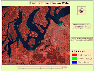
In certain areas of the water, layers 1-3 are much
lighter than normal. Layer 4 was a
little brighter and layers 5 and 6 were unchanged. From the image it appeared
this may be several areas of shallow water. Using the search cursor I verified
that there was a correlation between pixels in the histogram and the area I had
selected on the image. Once this was
done I used the Inquire box and the Subset & Chip tool to select an area
that best depicted this feature in the image and saved this as a new file. I then opened the file in ArcMap and created the map above.
Wednesday, October 16, 2013
Module 6 Spatial Enhancement

Week 6 of Remote Sensing covered Spatial Enhancement. In this module we covered various methods
used to enhance imagery. The map above is the result of starting with a LandSat
image and using the convolution tool to enhance the image, using the trial and
error method; I finally decided that using the 3x3Sharp5 filter worked best to
remove the striping and still keep the image somewhat identifiable. I am sure that with more experience I could
do a better job, but for now this is the best I could come up with.
Tuesday, October 15, 2013
Network Analyst - Report Week

This scenario involved
developing three separate crude maps for the distribution of emergency supplies
by the U.S. Army National Guard to three designated storm shelters. The map above depicts the supply route to one
of those shelters. All data to complete this map had been created during the
analysis week of this project. This
route is from National Guard Armory to Oak Park Elementary School. Written directions were also produced, copied
and reformatted. This map was created in
ArcMap, for ease of use, the route was shown in its entirety in one data frame,
then other data frames were added showing the route in shorter segments; the
reformatted driving directions were then added to the appropriate map segments then
exported to Adobe Illustrator where some text was fine-tuned and it was put in
a Grey-Scale format, as this would make the map easier to reproduce. Once this was complete the map was exported
as an image file.
Network Analyst - Report Week

This map was created
for a scenario which involved developing an informational pamphlet for patients
and their families that required evacuation from Tampa Bay General Hospital to
two other hospitals in the city. The map above depicts the evacuation route from
one of those hospitals. In this case, the pamphlet was provided; however, maps
and directions to the receiving hospitals needed to be created and added to the
pamphlet. All data to complete this map
had been created during the analysis week of this project. This route is from Tampa Bay General hospital
to St. Joseph’s hospital. Written
directions were also produced, copied and reformatted. Once the map was completed it was exported as an
image file and placed in the pamphlet.
The reformatted driving directions were also added to the pamphlet. Once the map was placed in the pamphlet, minor
modifications were made to have the map and driving directions appear as
uniform as possible while still proving useful.
Tuesday, October 8, 2013
Network Analyst-Analyze Week

This was the second week of my Network Analyst project. After preparing the data last week, I
calculated two evacuation routes from a hospital in the flood zone to hospitals
that were close by and at a higher elevation.
Then I calculated supply routes from the National Guard Armory to the three
designated Storm Shelters. Both the
evacuation routes and supply routes were then assigned a name and separate
color. This was all completed the “Routes”
tool in the Network analyst toolbox in ArcGIS.
Next, using the “New Service Area” function also located in the Network
Analyst toolbox, I calculated the nearest Designated Storm Shelter for areas
within Tampa Bay. Once the polygons were
created they were each also given a different color. Once the routes and storm shelter areas were
calculated I created the map above and like last week shared it as a map
package. Then I wrote an addendum to my E-mail explaining what I have done to
date. The map package, and e-mail were
then zipped into a single file and put into the dropbox.
Tuesday, October 1, 2013
Intro to ERDAS Imagine and Digital Data

Week 5 of Remote Sensing covered the basics of ERDAS Imagine. For this module we were given an opportunity
to explore where some of the tools were located and how to use them. We also
used the viewer to view data in ERDAS Imagine. We then preprocessed an image for making a map
in ArcGIS. I am however a little leery because the lab instruction mentioned “crashes”
and using “work arounds” to make ERDAS Imagine work properly. But with that said, I was able to create the
map above without much problem. The map depicts
a sub-section of an image of forested area in Washington state which was
classified into different types of ground cover.
Network Analyst - Prepare Week

For this week in Special Topics in GIS, Project 2, I started to
prepare data for a Network Analyst project. Project 2 is a hurricane evacuation
scenario for the Tampa Bay, Florida area. First I clipped and re-projected all
data sets into the same area and projection. This was completed using a provided mass
clipping and re-projection tool. Then a
DEM was reclassified and converted into a vector file format. From that I created
a “Flood Zone” layer. New fields were
added to the streets layer in anticipation for upcoming network analysis. After that I edited and exported the
metadata. I created a base map of the area
(above), and shared it as a map package. Then I wrote an E-mail to my “employer”
and a “Coworker” explaining what I have done to date, and what I think the next
steps should be. The map package,
metadata, and e-mail were then zipped into a single file and put into the
dropbox.
Tuesday, September 24, 2013
Ground Truthing and Accuracy Assessment

Tuesday, September 17, 2013
LULC Classification

Thursday, September 12, 2013
Project1 Analysis


Monday, September 9, 2013
Interpreting Aerial Photographs


Friday, September 6, 2013
Base Map for Project 1

Thursday, August 8, 2013
GIS Applications - Final Project
Link to my Final Project PowerPoint Presentation:
http://students.uwf.edu/prc7/FINAL_PPP.pptx
Link to my Final Project Slide by Slide Summary:
http://students.uwf.edu/prc7/Final_Summary.pdf
http://students.uwf.edu/prc7/FINAL_PPP.pptx
Link to my Final Project Slide by Slide Summary:
http://students.uwf.edu/prc7/Final_Summary.pdf
Saturday, August 3, 2013
GISProgramming Module 11

Thursday, August 1, 2013
Module 10 Creating Custom Tools


The second screen shot is the result of the tool being successfully ran after the parameters were set in the script.
Thursday, July 25, 2013
GIS Programming - Participation Assignment II
GIS as a Tool in Participatory Natural Resource Management
As the title states this article is about participatory GIS
being used a tool in the management of natural resources. Although the article is ten years old, as a
natural resource manager, I still found it interesting and relevant. The article covers a study of three areas in
Peru where local farmers, Non-governmental organizations (NGOs), and GIS
professional worked together to analyze data, and produce information that
could be easily used to best manage
resources for farming and the grazing of animals. This
particular article covers many of the pros and cons concerning the use of
participatory GIS in natural resource management. It brings to light many of the factors that
need to be addressed such as who are the stakeholders, how will participatory
GIS help each of them, and what do these stakeholders bring to the table. Other things addressed in the article I
found useful were deciding what data was to be used, was the data already
available or did it need to be collect, if so, how would the data be collected
and by whom. Once the data was
collected and analyzed the article touched on the issue of what output or end
product did the stakeholders require or want. In this case map covering larger areas, or as
referred to in the article as catchments, were useful for management of
resources on a larger scale, however many of the stakeholders in the article
needed a deliverable of smaller scale such as parcel level. Unfortunately, as in the case many times,
data on the parcel scale turned out to be complex to provide and costly. I have
considered investing time and resources in such a project myself and having
read this article feel I have a better understanding of the process involved.
Link:
Module 9 Debugging and Error Handling


Thursday, July 18, 2013
Module 7 Geometry and Rasters

Location Decisions


Saturday, July 13, 2013
GIS for Local Government


Thursday, July 11, 2013
GIS Applications Participation Assignment
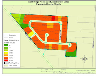
For my GIS Applications course we were given an assignment with two parts the first was to research our local property appraisal services, and answer four questions, which I have done below. For the second part of the assignment we were task with creating a map depicting assessed property values for the West Ridge Place subdivision located in Escambia county, Florida, and decide if some of these values need to be reviewed.

Question 1. The web
address for the Okaloosa, FL property appraisers mapping site is as follows:
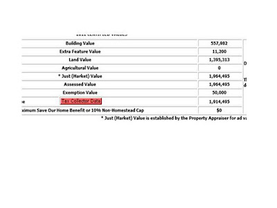
Question 2. The highest price paid for a property in
Okaloosa County for June of 2013 was 2.7 Million Dollars. The previous selling price appears to be $100.00.

Question 3. The assessed land value for this property is
1,395,313 dollars. Which is lower than the last selling price.
Question 4. I found it interesting that this property which
just sold for 2.7 million dollars shows a previous sale price of $100.00.

Question 5. Most parcels fall in a price range between
24,000 and 27,000 dollars. There are some that list for much less but these are
not available for development i.e. retention ponds, sewage lift station, and a
conservation easement. However one
parcel (0903101165) list for over 33,000 dollars, it appears to be similar in
size and location to the other parcels.
That being said this parcel should be reviewed.
Friday, July 5, 2013
Module 6 Explore/Manipulate Spatial Data

Home Land Security Week Two


Sunday, June 30, 2013
Module 5 Geoprocessing with Python

Thursday, June 27, 2013
Screen Shot for Homeland Security Prepare MEDS Module

Sunday, June 23, 2013
DC Crime Maps


Friday, June 21, 2013
Module 4 Dice Game Script

Thursday, June 20, 2013
GIS Application Participation Article Review
GIS Application Participation Article
Review
Title: The Incident
Map Symbology Story
Author: Lt. Chris Rogers
Date
created/posted: 4 May 2012
This article discusses the lack of
a set of standardized symbols for mapping incidents concerning first responders
such as Firefighters, Police, and Emergency Medical Technicians (EMT’s). The lack of standardization is experienced from
the operation centers of large multi-agency incidents down to the individual
first responder dealing with a small incident.
This issue is important for several reasons, safety of first responders
and victims, increases the speed in
which information can be digested, and resulting in the ability in which important
decisions can be made to mitigate potential hazardous situations before ever
arriving on the scene of the incident, are to name but a few. So, with these things in mind during December
of 2010 a plan was put together to look at tactical mapping symbology for
emergency services on both pre-incident and incident levels. The focus was to see what was already
available and then identify areas where additional work was needed.
First, a group comprised of first
responders with GIS experience from all across North America and belonging to several
agencies including the National Alliance for Public Safety GIS (NAPSG)
Foundation, the Department of Homeland Security (DHS), the Science and
Technology First Responders, and the Federal Emergency Management Association
(FEMA) was formed, to start some initial planning. From this initial planning some things
became apparent:
·
Incidents are complex, dynamic, and hard to map
·
Information concerning an incident can be
collected before, during, and after the incident
·
Although most public safety agencies use a
standard National Incident Management Systems (NIMS) approach to handling an
incident, the nuances of the incident change between agencies
With all of this in mind the group set some goals, which
included ideas like not re-inventing the wheel, keeping the symbols flexible and
scalable, and trying to consider all hazards possible for the responder. Before the group was to actually meet face
to face, the leaders of the group, Lt Chris Rogers and Rebecca Harned assigned
some homework. They were to research and identify any existing standard symbols
and lessons learned and they were given
a mapping scenario to complete. The scenario was of a small structure fire and
they were to create a map depicting hazards on the incident, features to help
mitigate an incident, and the location of command functions. Finally, in March of 2011, the group met in
person in Seattle, Washington and for three days discussed their research and
mapping projects.
At the conclusion of the meeting, the group decided that to improve
Incident map symbology the following is required:
·
The need for guidelines not standards
·
Symbols should be broken into different
categories (such as pre-incident, hazard, and incident command symbols)
·
The shape of the symbol should be defined by the
category
·
Symbols must be able to be hand drawn. (For use
in the field on paper maps)
·
Symbols cannot require a lot of training to
understand
·
Symbols must be useable in routine business of a
safety agency
While this list is by no means complete, it is a good
starting point. This subject is dynamic
and will need to be refined over time. I do believe the goals of the project
were met; however, one of the biggest problems is getting everyone onboard;
some think change is a bad thing. Also getting this material out to the end
users will take time and technology. As
more and more first responders buy into these guidelines, become more
comfortable with the system, and see the results the system will grow exponentially
and this will benefit all concerned.
Thursday, June 13, 2013
Hurricanes


Friday, June 7, 2013
Tsunami Lab Part 3 Model

Subscribe to:
Posts (Atom)