
Thursday, January 31, 2013
Adobe Illustrator - Cities of Florida Map
Sunday, January 27, 2013
States of Mexico

Transportation in Central Mexico


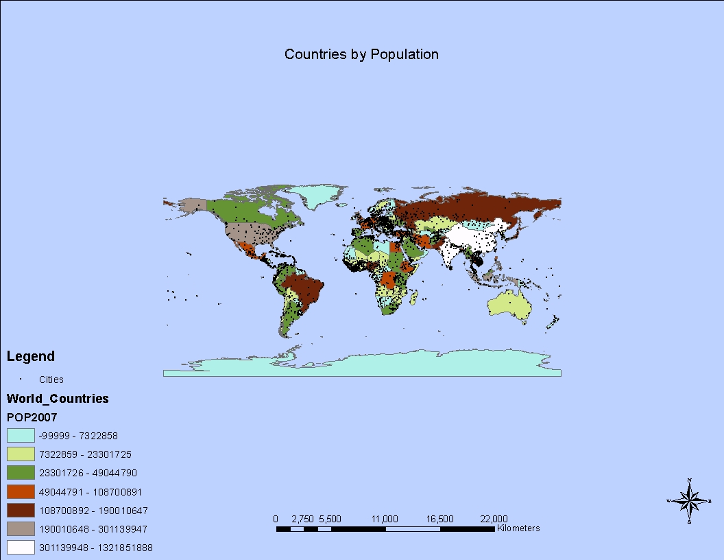
Friday, January 25, 2013
Map Depicting Four Methods of Data Classification

Map Depicting Natural Breaks Classification Method

Monday, January 21, 2013
Location of UWF Campus in Escambia County FL.

Cartography Module 2 Histogram

This histogram is a graphical depiction of data using bars
to show the different values of the data within each column or bin. It was constructed in Microsoft Excel, using
data provided in my Cartographic Skills course. This data was analyzed, and
then bin numbers were selected that provided the best array of the data. Histograms
are useful when analyzing data with two or more attributes. Histograms display the
data in a manner that is visually easier to interpret than a scatter plot
graph, or a string of raw data.
Sunday, January 13, 2013
Poorly-designed Map

I consider
this to be a poorly-designed map for several reasons. I found this map in an article about the
concern of deforestation in a rural area. It provides no data concerning
deforestation whatsoever, thereby missing the target audience. Perhaps providing data on acreage and species
of forested area to be lost would have been a better choice. The use of the
text boxes is more distracting than informative; I also became confused trying
to follow the arrows. The data provided in the text boxes is also in
the legend. Much of the information
provided is also redundant.
Well-designed Map

Although a
little depressing I found this to be a well-designed map as it possesses several of the
20 Tufteisms, along with many of the six commandments. It is a well-designed presentation of
interesting data. I believe it also communicates ideas with clarity, precision,
and efficiency, and has clear, detailed, and thorough labeling. It definitely contains substantial
information that engages the emotions.
There is no “map crap” it has a clear concise title; the states are shown
with their shape alone. A short to the
point statement is contained within of the state borders.
Wednesday, January 9, 2013
Subscribe to:
Comments (Atom)