
Tuesday, October 29, 2013
Module 8 Thermal and Multispectral Analysis
Thursday, October 24, 2013
Web Applications: Prepare Week
For this phase of project three, in Special Topic in
GIS, we were tasked with exploring the workings of a story map. A story map is a map that uses
text, multimedia, and other interactive functions, to inform, entertain, and
inspire viewers about a topic.
I intend to create a
story map that shows eleven points of interest within Okaloosa County,
Florida. Originally, it was to be
“points of interest in my town”; however, living in Holt, Florida that would be
Brown’s Gas Station, a church, and an abandoned elementary school. So, I expanded the area to include Okaloosa
County. I plan on starting with a base
map of the area and show the location of the points of interest with configured
pop-up icons Once the user clicks on the
icon, it will show a brief description, with a prompt for a more detailed
description, such as address, schedule of events, hours of operation, or menu
depending on the location. I do not plan
to have a route or tour of the sites, but by individualizing the icons, the
user should be able to click on the location of interest and find all related
information with a few clicks of the mouse.
Wednesday, October 23, 2013
Module 7 Multispectial Analysis
For this module in Remote Sensing we were to identify certain features of an image based on their pixel count in certain layers. This was accomplished using the image histogram and the inquire cursor tool.


In layer four there was a spike between pixel values 12 and 18. This was on the left side of the histogram, and from the module I knew this would mean a dark area of the image. From the image it appeared this may be deep water. Using the search cursor I verified that there was a correlation between pixels in the histogram and the area I had selected on the image. Once this was done I used the Inquire box and the Subset & Chip tool to select an area that best depicted this feature in the image and saved this as new file. I then opened the file in ArcMap and created the map above.

In layers 1-4 there was a small spike around pixel value 200 and a large spike between pixel values 9 and 11 in layers 5 and 6. This was on the right side of the histogram, and from the module I knew this would mean a very light area of the image. From the image it appeared this may be the snowcapped mountains. Using the search cursor I verified that there was a correlation between pixels in the histogram and the area I had selected on the image. Once this was done I used the Inquire box and the Subset & Chip tool to select an area that best depicted this feature in the image and saved this as a new file. I then opened the file in ArcMap and created the map above.
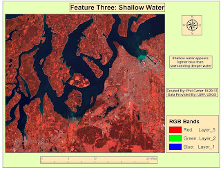
In certain areas of the water, layers 1-3 are much
lighter than normal. Layer 4 was a
little brighter and layers 5 and 6 were unchanged. From the image it appeared
this may be several areas of shallow water. Using the search cursor I verified
that there was a correlation between pixels in the histogram and the area I had
selected on the image. Once this was
done I used the Inquire box and the Subset & Chip tool to select an area
that best depicted this feature in the image and saved this as a new file. I then opened the file in ArcMap and created the map above.
Wednesday, October 16, 2013
Module 6 Spatial Enhancement

Week 6 of Remote Sensing covered Spatial Enhancement. In this module we covered various methods
used to enhance imagery. The map above is the result of starting with a LandSat
image and using the convolution tool to enhance the image, using the trial and
error method; I finally decided that using the 3x3Sharp5 filter worked best to
remove the striping and still keep the image somewhat identifiable. I am sure that with more experience I could
do a better job, but for now this is the best I could come up with.
Tuesday, October 15, 2013
Network Analyst - Report Week

This scenario involved
developing three separate crude maps for the distribution of emergency supplies
by the U.S. Army National Guard to three designated storm shelters. The map above depicts the supply route to one
of those shelters. All data to complete this map had been created during the
analysis week of this project. This
route is from National Guard Armory to Oak Park Elementary School. Written directions were also produced, copied
and reformatted. This map was created in
ArcMap, for ease of use, the route was shown in its entirety in one data frame,
then other data frames were added showing the route in shorter segments; the
reformatted driving directions were then added to the appropriate map segments then
exported to Adobe Illustrator where some text was fine-tuned and it was put in
a Grey-Scale format, as this would make the map easier to reproduce. Once this was complete the map was exported
as an image file.
Network Analyst - Report Week

This map was created
for a scenario which involved developing an informational pamphlet for patients
and their families that required evacuation from Tampa Bay General Hospital to
two other hospitals in the city. The map above depicts the evacuation route from
one of those hospitals. In this case, the pamphlet was provided; however, maps
and directions to the receiving hospitals needed to be created and added to the
pamphlet. All data to complete this map
had been created during the analysis week of this project. This route is from Tampa Bay General hospital
to St. Joseph’s hospital. Written
directions were also produced, copied and reformatted. Once the map was completed it was exported as an
image file and placed in the pamphlet.
The reformatted driving directions were also added to the pamphlet. Once the map was placed in the pamphlet, minor
modifications were made to have the map and driving directions appear as
uniform as possible while still proving useful.
Tuesday, October 8, 2013
Network Analyst-Analyze Week

This was the second week of my Network Analyst project. After preparing the data last week, I
calculated two evacuation routes from a hospital in the flood zone to hospitals
that were close by and at a higher elevation.
Then I calculated supply routes from the National Guard Armory to the three
designated Storm Shelters. Both the
evacuation routes and supply routes were then assigned a name and separate
color. This was all completed the “Routes”
tool in the Network analyst toolbox in ArcGIS.
Next, using the “New Service Area” function also located in the Network
Analyst toolbox, I calculated the nearest Designated Storm Shelter for areas
within Tampa Bay. Once the polygons were
created they were each also given a different color. Once the routes and storm shelter areas were
calculated I created the map above and like last week shared it as a map
package. Then I wrote an addendum to my E-mail explaining what I have done to
date. The map package, and e-mail were
then zipped into a single file and put into the dropbox.
Tuesday, October 1, 2013
Intro to ERDAS Imagine and Digital Data

Week 5 of Remote Sensing covered the basics of ERDAS Imagine. For this module we were given an opportunity
to explore where some of the tools were located and how to use them. We also
used the viewer to view data in ERDAS Imagine. We then preprocessed an image for making a map
in ArcGIS. I am however a little leery because the lab instruction mentioned “crashes”
and using “work arounds” to make ERDAS Imagine work properly. But with that said, I was able to create the
map above without much problem. The map depicts
a sub-section of an image of forested area in Washington state which was
classified into different types of ground cover.
Network Analyst - Prepare Week

For this week in Special Topics in GIS, Project 2, I started to
prepare data for a Network Analyst project. Project 2 is a hurricane evacuation
scenario for the Tampa Bay, Florida area. First I clipped and re-projected all
data sets into the same area and projection. This was completed using a provided mass
clipping and re-projection tool. Then a
DEM was reclassified and converted into a vector file format. From that I created
a “Flood Zone” layer. New fields were
added to the streets layer in anticipation for upcoming network analysis. After that I edited and exported the
metadata. I created a base map of the area
(above), and shared it as a map package. Then I wrote an E-mail to my “employer”
and a “Coworker” explaining what I have done to date, and what I think the next
steps should be. The map package,
metadata, and e-mail were then zipped into a single file and put into the
dropbox.
Subscribe to:
Posts (Atom)