Link to my Final Project PowerPoint Presentation:
http://students.uwf.edu/prc7/FINAL_PPP.pptx
Link to my Final Project Slide by Slide Summary:
http://students.uwf.edu/prc7/Final_Summary.pdf
Showing posts with label GIS 4048 Applications. Show all posts
Showing posts with label GIS 4048 Applications. Show all posts
Thursday, August 8, 2013

Thursday, July 18, 2013
Location Decisions


Saturday, July 13, 2013
GIS for Local Government


Thursday, July 11, 2013
GIS Applications Participation Assignment
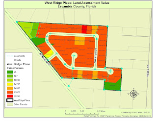
For my GIS Applications course we were given an assignment with two parts the first was to research our local property appraisal services, and answer four questions, which I have done below. For the second part of the assignment we were task with creating a map depicting assessed property values for the West Ridge Place subdivision located in Escambia county, Florida, and decide if some of these values need to be reviewed.

Question 1. The web
address for the Okaloosa, FL property appraisers mapping site is as follows:
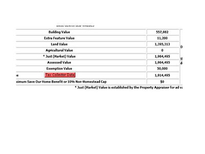
Question 2. The highest price paid for a property in
Okaloosa County for June of 2013 was 2.7 Million Dollars. The previous selling price appears to be $100.00.

Question 3. The assessed land value for this property is
1,395,313 dollars. Which is lower than the last selling price.

Question 4. I found it interesting that this property which
just sold for 2.7 million dollars shows a previous sale price of $100.00.

Question 5. Most parcels fall in a price range between
24,000 and 27,000 dollars. There are some that list for much less but these are
not available for development i.e. retention ponds, sewage lift station, and a
conservation easement. However one
parcel (0903101165) list for over 33,000 dollars, it appears to be similar in
size and location to the other parcels.
That being said this parcel should be reviewed.

Friday, July 5, 2013
Home Land Security Week Two


Thursday, June 27, 2013
Screen Shot for Homeland Security Prepare MEDS Module

Sunday, June 23, 2013
DC Crime Maps


Thursday, June 20, 2013
GIS Application Participation Article Review
GIS Application Participation Article
Review
Title: The Incident
Map Symbology Story
Author: Lt. Chris Rogers
Date
created/posted: 4 May 2012
This article discusses the lack of
a set of standardized symbols for mapping incidents concerning first responders
such as Firefighters, Police, and Emergency Medical Technicians (EMT’s). The lack of standardization is experienced from
the operation centers of large multi-agency incidents down to the individual
first responder dealing with a small incident.
This issue is important for several reasons, safety of first responders
and victims, increases the speed in
which information can be digested, and resulting in the ability in which important
decisions can be made to mitigate potential hazardous situations before ever
arriving on the scene of the incident, are to name but a few. So, with these things in mind during December
of 2010 a plan was put together to look at tactical mapping symbology for
emergency services on both pre-incident and incident levels. The focus was to see what was already
available and then identify areas where additional work was needed.
First, a group comprised of first
responders with GIS experience from all across North America and belonging to several
agencies including the National Alliance for Public Safety GIS (NAPSG)
Foundation, the Department of Homeland Security (DHS), the Science and
Technology First Responders, and the Federal Emergency Management Association
(FEMA) was formed, to start some initial planning. From this initial planning some things
became apparent:
·
Incidents are complex, dynamic, and hard to map
·
Information concerning an incident can be
collected before, during, and after the incident
·
Although most public safety agencies use a
standard National Incident Management Systems (NIMS) approach to handling an
incident, the nuances of the incident change between agencies
With all of this in mind the group set some goals, which
included ideas like not re-inventing the wheel, keeping the symbols flexible and
scalable, and trying to consider all hazards possible for the responder. Before the group was to actually meet face
to face, the leaders of the group, Lt Chris Rogers and Rebecca Harned assigned
some homework. They were to research and identify any existing standard symbols
and lessons learned and they were given
a mapping scenario to complete. The scenario was of a small structure fire and
they were to create a map depicting hazards on the incident, features to help
mitigate an incident, and the location of command functions. Finally, in March of 2011, the group met in
person in Seattle, Washington and for three days discussed their research and
mapping projects.
At the conclusion of the meeting, the group decided that to improve
Incident map symbology the following is required:
·
The need for guidelines not standards
·
Symbols should be broken into different
categories (such as pre-incident, hazard, and incident command symbols)
·
The shape of the symbol should be defined by the
category
·
Symbols must be able to be hand drawn. (For use
in the field on paper maps)
·
Symbols cannot require a lot of training to
understand
·
Symbols must be useable in routine business of a
safety agency
While this list is by no means complete, it is a good
starting point. This subject is dynamic
and will need to be refined over time. I do believe the goals of the project
were met; however, one of the biggest problems is getting everyone onboard;
some think change is a bad thing. Also getting this material out to the end
users will take time and technology. As
more and more first responders buy into these guidelines, become more
comfortable with the system, and see the results the system will grow exponentially
and this will benefit all concerned.
Thursday, June 13, 2013
Hurricanes


Friday, June 7, 2013
Tsunami Lab Part 3 Model

Part 3 Tsunami Lab

Japan Tsunami Lab

Tuesday, May 28, 2013
Areas of possible Inudation in the Event of Volcanic activity at Mt. Hood Oregon.

Possible areas of inudation in the event of a volcanic eruption of Mt. Hood Oregon.

Sunday, May 19, 2013
GIS Applications for Environmental Management
 |
|
I am interested in the GIS application for Environmental
Management, or more specifically Wildlife habitat management. This application
would fall under the Natural Resources Industry. The problems that can be addressed with this
application are aiding in the determination of the amount, location, and
varying degrees of habitat productivity, and how all these factors affect the
population of the species involved.
Using the data provided from these applications managers can make
decisions that will positively affect species population in the future. GIS is
used in many ways in this application, from mapping habitat boundaries
retrieved from GPS units to tracking an individual animal’s movement with the
use of remote sensing, to name just a few. I am interested in this application
because I enjoy the outdoors and all the plants and animals found there. Earth has a limited number of resources and
we need to be good stewards of these resources.
As a grandfather, I also believe
we owe future generations the same or better opportunities to experience these
things that we now enjoy. I would like
to learn more about remote sensing to better determine habitat ranges of
certain species. Animals behave more
naturally when they have little or no interaction with humans, so I believe
remote sensing is the best way to observe without influencing behavior.
Photo Source: http://www.fws.gov/lafayette/images/GIS_LA_Black_Bear_Habitat.jpg
|
Subscribe to:
Posts (Atom)